
Custom Decals
Colour Specification Guide
This guide is for those who wish to commission some custom decals from me, and need to specify precise colours for me to use. Please also see the companion guides for specifying other aspects of custom decals and preparing artwork yourself for me to print for you.
This guide is also available in downloadable form here.
Colours
My printer does not use white ink, and only the black ink is opaque (the others are translucent). Therefore to use transparent decal paper either the decals must contain only black (or very dark) features, or the surface they are to be applied to must be white (or a very light, neutral grey). For any other colour combinations with transparent paper the surface colour will show through the decal and distort its colours.
The solution to this is to use opaque white decal paper and incorporate into the decals a background colour that matches the colour of the surface they are to be applied to. Although very thin, the white decal backing film may be visible around the edges of the decal once in place, especially if the decal can be viewed edge-on. This is easily cured by touching up around the edges of the decal with thinned paint of the same colour as the surface the decal has been applied to. The idea here is to tint the edge of the decal while not significantly affecting the surface paint finish. To help with this the decals should include a narrow border of background colour around the edges of the actual decal pattern.
It can also help hide the decal edges if the decals are designed to fit against natural features such as ridges or grooves of the surface they are to be applied to.
Colour Matching
I have developed a colour matching method for finding the colour my printer needs to be given to produce a specific colour on the decal paper. I match to paints from the Railmatch and Humbrol enamel paint ranges as standard (I assume their acrylic and spray paints of the the same name will be the same colour as the enamel ones). I can match to any other paint colour you require, but will charge a small fee per colour (see my quote for the amount) and will require a sample from you painted onto a scrap of material such as plastic sheet at least 2 cm square.
If you are (re)painting your model, generating suitable samples should be easy: use the same paint you use to paint your model. Also prepare your sample with the same primer etc. you use for your model, in case it affects the finished colour.
If you require several colours to be matched, the samples can be painted onto a single strip (or small sheet), but make sure that each sample is still at least 2 cm square, and clearly identify which colour is which.
Paint colours I have already matched will not incur the fee, nor require a sample. Paints from the Railmatch and Humbrol ranges that I have not yet matched will also not incur the matching fee, but I may still require a sample.
Blacks are difficult to match (the small amounts of other ink colours needed can make the area look spotty), but Railmatch R205 Rail Black paint is a good match for the black ink used by my printer.
I also cannot print metallic or fluorescent colours; the best I can do is a flat colour that approximates the general appearance of the special paint colour.
Matching Existing Models
The process described above applies where you are to (re)paint your model. For existing models that you do not want to repaint, generating the colour samples for me to match will be more complex: you will need to find a paint that matches the colour of your model to generate your sample.
The starting point will be one or more standard paints (e.g. from the Humbrol and Railmatch ranges) that come close to the colour of your model. Use these to generate colour samples by painting them onto a piece of thin sheet material, such as plastic sheet. The paint will need to reach at least one edge, and paint on that edge too. If you are generating more than one sample, mark them with the corresponding paint specification so that you don't get them mixed up.
Performing the Comparison
Allow the samples to dry, then compare them with an appropriate area of your model: hold the painted edge of a sample against the model such that your light source shines along the edge of the sample. That way the edge shouldn't create highlights or shadows that interfere with the comparison. If the sample matches well enough, it should “disappear” into the model, with the edge difficult to see. It can help to defocus your eyes to blur any remaining edge effects.
Your light source should be bright and of wide spectral content. In the absence of a proper balanced artificial light source designed for professional colour work, natural light is probably best, with bright but thinly overcast conditions better than full sunlight. Dark overcast conditions are probably not bright enough. Most artificial light sources aren't good either, especially modern electronic versions (e.g. LEDs), as they are likely to be a blend of narrow-spectrum colours designed to fool the eyes into thinking the light is white. The gaps in their spectrum can hide differences in the colours you are comparing.
You will also need good colour vision (i.e. in no way colour blind), or enlist the help of someone to do the comparison for you.
An alternative to the manual comparison method above is to use a good quality camera to photograph your model with the sample laid on it (or perhaps close to it , but subject to the same light conditions). Then use an app that allows you to examine the colours of individual pixels, or even better, measure an average of a group of adjacent pixels. When properly matched, the RGB colour values of the sample and your model should be the same (or at least within 1 or 2 points). Don't try to photograph your model and sample separately For the comparison to work the model and sample must be part of the same photo, taken with the same lighting and camera settings.
Adjusting your Sample
If you find a standard paint that matches your model well, that's great! However, your will likely need to modify the colour of your sample and try the comparison again.
The best way to think of colour for this is in terms of its Hue, Saturation and Brightness, see the illustration below. This shows the emissive spectrum, as used by most screens, which has red, green and blue as the primary colours. The reflective (or absorptive) spectrum, as used when mixing paints and inks, however, uses red, yellow and blue for primary colours. Printers generally blend cyan, magenta and yellow inks, plus black to control the brightness and saturation (white is provided by the paper).
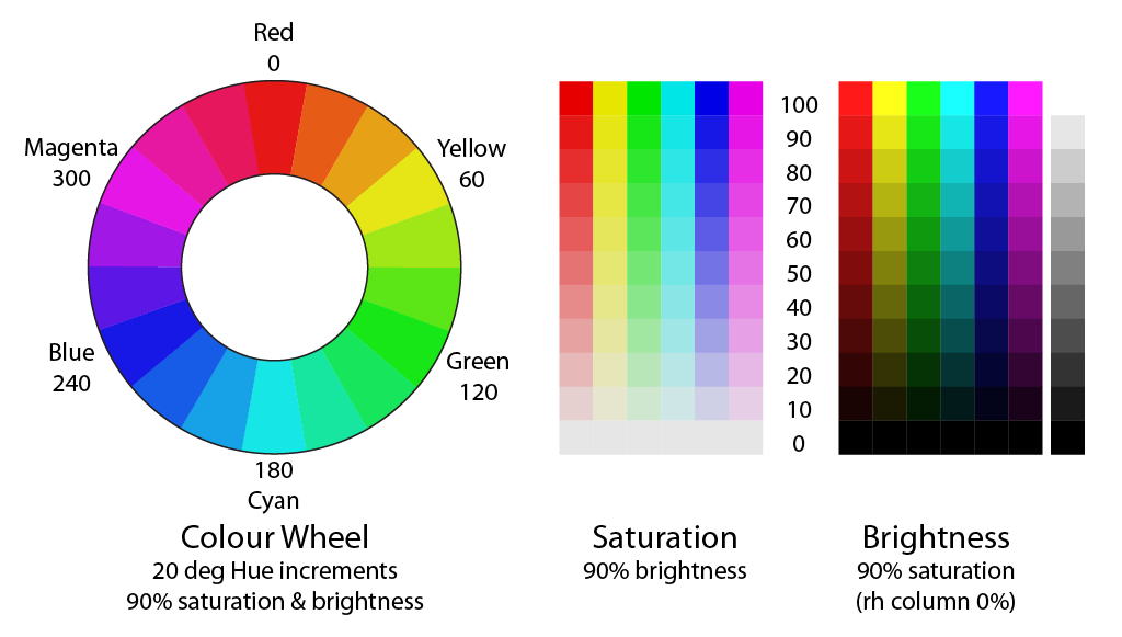
Hue is the basic colour value, specified in terms of an angle around the colour wheel – the primary colours are arranged at the 120 degree interval points, with the other colours spread in between.
Brightness is the level of white/grey/black in your colour, arranged in a scale from black (0%) to white (100%).
Saturation is then the blend between the hue and brightness: 0% is fully desaturated and results in the shade of grey from the brightness value. 100% is full strength colour, with no grey.Adjusting the hue is tricky. You will need paint colours on either side of, but reasonably close to, your starting colour. Add small quantities at a time to your paint to move its colour in the appropriate direction.
To adjust the brightness you will need to add small quantities of white or black (or perhaps grey to give a smaller change). This will inevitably also reduce the saturation value. To increase it you will need to add more of the hue colour. The white, grey or black paints need to be pure, neutral colours, with no hue content.
It is best to mix a reasonable quantity of paint, in a small pot that you can seal between sessions. You will also need some of the matched paint to touch up the edges of your decals once they have been applied to your model.
The small quantities of other paints can be added to the mix using a small syringe, bulb-type dropper, or even drop by drop on the end of a cocktail stick. Be sure to use a separate tool for each added paint, to avoid contamination. Then mix the modified paint thoroughly before applying it to a clean sample strip.
It is best to allow your sample to dry (at least to touch-dry) before comparing it with your model. However, in the early stages you can probably get away with comparing a wet sample. Perhaps use a layer of cling film, or similar, to protect your model from the wet paint, or be prepared with a clean cloth or kitchen towel to quickly wipe away any paint that gets onto your model. Once you're reasonably satisfied with a wet sample, allow it to dry properly, then compare it again.
It is probably best to try to match the hue in the first step, then adjust the brightness and saturation. You will probably then need to go around the hue-brightness-saturation adjustment loop several times before finding a suitable match.
Once you have produced a sample you're happy with, you'll need to send it to me to match your decals to. For this, the sample needs to be at least 2cm on a side. Otherwise the size of your sample strips should be small enough to be entirely contained within an appropriate area of your mode during comparison.
Feature Colours
I will also need to know the colour(s) your require for other features within your decals. Accurate colour matching is generally not necessary, but I will need some indication of the colour your require. Colour prototype photos can be useful, in which case I will try to create the same appearance of the features against their background colours in the finished, printed decals.
You are also welcome to specify paint colours from the Humbrol and Railmatch ranges to indicate the colours required. If you really want accurate specific colours for features of your decals I can match colours for those too, in the same way as described above for background colours.